I recently participated in two separate ‘startup incubator’ brainstorming programs, in the same city, a couple of days apart, with two different high-tech companies operating independently of each other. It was surprising to see how different was the quality of their results (by my own estimation), despite only a few apparent small differences in how they were run.
Both programs had 70-80 motivated and well-educated adults from diverse national and cultural backgrounds. They divided up into 10 teams of roughly equal size. Each team worked intensely over the course of a day or two to generate one new business concept for a product or service that could be offered to the marketplace. At the end, each team gave a 3-minute ‘pitch’ presentation describing the idea they had generated, there was a short question-and-answer period after each presentation, and a winner was selected from the 10 pitches.
Both programs had comfortable conference areas with tables and chairs, food, fizzy drinks, electricity and internet access, large pieces of paper and colorful pens and little more than that. No big piles of cash were dropped into anyone’s lap.
Both program organizers offered their teams a list of questions to help guide the idea formation. In one case, this was in the form of Osterwalder’s Business Model Canvas, which you can see below. In the other, essentially the same topics were covered, but as a list of questions starting with Who…, What…, Where…, How…, etc.

Having seen all of final business ideas, in my opinion the results of one of the programs seemed greatly superior to the other, both in the slickness of the presentations and in the quality of the underlying ideas. This got me thinking about what differences there were in this ‘Star’ program that might have made the results be (or maybe just seem) better than in the ‘Regular’ program. Here are a few things I noticed:
1. In the Star program, the teams were formed according self-expressed interest
The Star program started with 10 self-selected people making one-minute presentations about what their basic business idea or topic was. After this pitching session, these 10 team leaders scattered around the room and the remainder of the participants came to find out more about the ideas that intrigued them. The participants each wore sticky notes briefly describing their background and skills. The team leaders got final say in selecting who would be on their team.
In the Regular program, the team leaders and each team’s members were selected by the overall program organizer. Each participant was told a couple of weeks before the program day which team they would be on, the leader was selected by the program organizer, and the team was asked to begin brainstorming a business idea topic that they would develop on the program day.
2. In the Star program, there was a strong emphasis on validation, validation, validation
At the beginning of the Star program, participants were given an explicit list of criteria on which their idea would be judged. One-third of these criteria involved the extent to which the team had demonstrated that (1) their idea will actually work and (2) that there exists a market for it. The teams consisted of both experts in topic and non-experts, and all of the teams had intermediate appointments scheduled with outside coaches, some of whom were experts in the team’s idea’s general industry and some were not.
In addition to ‘sanity checking’ their ideas with experts and non-experts, the teams in the Star program were asked to contact potential customers. Several teams put surveys out on SurveyMonkey and Facebook. One got more than 50 replies from within their city between the hours of 10:00 in the evening one day and 8:00 the next morning. One went out to meet with prospective customers and another went out to shoot a demo video. Another set up a functional website that described the team’s idea and provided a box for website visitors to enter their e-mail address if they wished to learn more. (5 prospective customers signed up.) Several contacted support staff from different companies that might be key suppliers or partners. One even set up an in-person meeting with a key partner.
All of the teams provided basic financial estimates of unit cost and unit revenue (and therefore, unit profit) and market size. In the Regular program, the teams were not asked to estimated market size or the profit potential, and so none of them did.
In the Star program there was a strong emphasis on results and action over talk and deliberation. The participants were even told “less talk, more action”. In the Regular program, to the best of my knowledge none of the teams spoke with outside experts, contact potential customers, or even left the building to get fresh air.
3. In the Star program, teams were told what to do, not how to do it
The Star program had no template for the final presentation: as a result, every presentation was unique, some with very high quality graphics, professional looking logos, creative videos, working iPhone app prototypes, a functional website. In the Regular program, the teams were given template presentations where the teams had to ‘fill in the boxes’. Most teams used this template with little modification, and some added additional slides of nice-looking photos to demonstrate their ideas.
4. The Star program had significant outside involvement
In addition to the already mentioned outside coaches, the Star program’s judging was done a panel of 9 people, including local business founders, a city politician and a professional venture capitalist, none of whom were involved in the coaching. In the Regular program, the judging was entirely by the program participants and program organizer, with no one even from within the wider company.
5. The Star program’s ideas went through a larger number of iterations
The final difference that I think might have been important was the duration of the programs and the emphasis on iterating through ideas. The Star program ran for 48 hours, while the Regular program was a single business day. In the Star program, participants were encouraged to ‘Build, Measure, Learn’. The results of the online survey indicated that one team’s initial idea might not have a market interest. The results from the survey were used to ‘pivot’ to a related, but distinctly different, idea. The final presentation was a third idea.
There might have been other important differences, or maybe I am wrong in my assessment of the quality of the final ideas, but if I were in charge of a similar business concept brainstorming day, I would work to make the day more like the Star program and less like the other one.

Blue and white glass beads. Sterling silver findings.
A friend found a pearl in an oyster from the supermarket. I made a ring from it by attaching a short segment of sterling silver tubing to a sterling silver band I made. The tubing acts as a bezel cup to hold the pearl.
 Sterling silver (3 g), pearl.
Previously I looked at the number of times different 4-digit sequences of numbers starting with ‘1’ appear in English-language books published in the year 2000. I took statistics from Google and looked at the number of times the digits ‘1491’ appeared versus ‘1492’. Obviously not all 4-digit numbers are references to years, so I simply dropped numbers that are evenly divisible by 10.
Google offers statistics for books published in a variety of languages, so I have repeated my analysis using values from the German-language books that Google has scanned.
The graph below shows the frequency of 4-digit numbers in German-language works. Number after 1700 are much more frequent than those before 1700, so to make things easy to read, I have put the y-axis on a logarithmic scale.

(click image to enlarge)
As in the case with English-language books, some values make a little blip on the graph. ‘1648’ is more common than ‘1647’ or ‘1649’, probably because that was the year that The Thirty Years’ War ended. (The number ‘1618’ is more common than ‘1617’, but for some reason ‘1619’ is more common than either ‘1618’ or ‘1617’.)
I have marked some other numbers that look interesting. Some are easy to explain, but others are not.
For example, we see ‘1492’ again, though it is much less prominent than was the case for English-language books. Some other numbers that are common in English-language books are also hard to see here – ‘1066’, for example’, and ‘1776’. Some others that I would expect, like ‘1517’, the year that Martin Luther started the Protestant Reformation, and ‘1989’, the fall of the Berlin Wall, do not stand out either.
Some of the values are difficult to understand their importance, like ‘1408’ and ‘1711’. I don’t know anything important that happened in central Europe in those years. In fact, all of the 1700s seem to be a time when nothing important happened in German-speaking lands, which I find strange given that it was the time of Bach, Mozart, Euler and Goethe. But ‘1848’, a year of revolutions in much of Europe, including Germany, is easy to see, as are ‘1789’ and ‘1815’.
In numbers that start with ’19’, important ones obviously include ‘1914’ and ‘1918’, which were the start and end of the First World War, ‘1933’, the year that the Nazis came to power and of course Germans are interested in ‘1945’, which is famous for being the last year that the Cubs made it to the World Series.
Overall though, I find it rather depressing how many of the references, like with English-language texts, seem to be to wars and revolutions.
I saw this post ‘The Equation that Governs Your Sales Team’s Effectiveness‘ by Thomasz Tunguz. It is not a very long read, but every sentence is dense with details, so it provides a very good list of factors that affect ‘Sales Velocity’, or the rate at a sales team can deliver money.
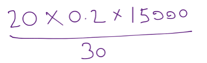
The basic argument is that the Sales Velocity depends on the amount of possible sales in progress (or, ‘Work in Progress’) and the Sales Cycle (the time it takes to close a sale). If there are 20 possible sales contracts being negotiated and it takes 30 days to close a contract, then on average, 20/30 or about 0.66 contracts will close every day. If 20% of those closings are sales (the ‘Win Rate’) and each sale brings in $15,000 (‘Average Price’), then the Sales Velocity is: Work in Progress x Win Rate / Sales Cycle x Average Price.
For these figures, we would expect the ‘Sales Velocity’ to be 20 x 0.2 / 30 x $15,000 = $2,000 per day
What happens if the Sales Cycle (the time it takes for the buyer to make a decision on whether or not to sign the sales contract) drops from 30 days down to 20?
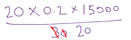
In that case, the ‘Sales Velocity’ to be 20 x 0.2 / 20 x $15,000 = or $3,000 per day. By making the Sales Cycle shorter, the Sales Velocity goes up.
This all seems very straightforward, but as Mr. Tunguz points out, “these numbers don’t move in isolation; they are not independent”. To see how that might work, I made a more-detailed simulation of the Sales process dynamics using a piece of software called STELLA.
Conceptually, I think of the flow of money to be like the flow of water through a pipe. I have shown Mr. Tunguz’s Sales Velocity as a pipe in the diagrambelow. The ‘Sales Velocity’ depends on the ‘Average Price’ (in dollars per sales contract) and the rate of ‘signing Contracts’ (which is the remainder of his equation: ‘Work in Progress x Win Rate / Sales Cycle’)
I think of the ‘Work in Progress’ (the number of possible sales contracts that are being negotiated) as a bucket, represented by the rectangle. There are only two ways to get out of the that bucket – have the customer say No and flow out through the ‘losing Contracts’ pipe or have the customer say Yes and flow out through the ‘signing Contracts’ pipe’. The rate of ‘closing Work in Progress’ is the amount of Work in Progress divided by the Sales Cycle and the rate of signing Contracts and therefore, the rate of losing Contracts, both depend on the ‘Win Rate’.
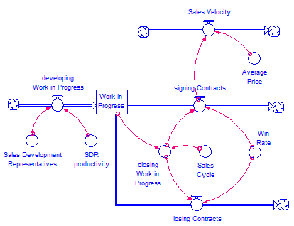 Mr. Tunguz mentions that Sales Development Representatives deliver a certain number of qualified leads per time, adding possible sales to the ‘Work in Progress’ bucket.
Now we have a more-detailed, more kneebones-connected-to-the-thighbone operational model of what is going on an how all the big pieces are connected. I ran a simulation using a value of ‘Sales Cycle’ of 30 for the first 20 days. We can see that the Sales Velocity is $2,000/day. At Day 20, the value of ‘Sales Cycle’ drops to 20 days. That is, the account executives get faster at closing (both winning and losing contracts).
We can see that the Sales Velocity jumps up to $3,000 per day… but just for one day! It slowly drops back to $2,000/day by Day 90.
 Even though the Sales Cycle is permanently shorter, the effect of the shortening quickly wears off. What is going on here? When we shorten the Sales Cycle, the flow rates out of ‘Work in Progress’ get faster (there are more contracts won and lost each day). But, the rate at which the Sales Development Representatives deliver leads (‘developing Work in Progress’) does no change. Higher out-flows from the bucket but the same rate of adding new work to the bucket means that the total amount of ‘Work in Progress’ must drop over time.
Shortening the Sales Cycle without adding more SDRs (or increasing their per-person productivity), means that the effect on the Sales Velocity will be short-lived.
Mr. Tunguz lays out all sorts of other scenarios (“increasing the average price”, “seasonality”, “company maturity”) that are too complex to deal with right here, but the simulation I have made could be the basis for exploring the ramifications of those in greater detail.
I saw this fascinating article from Science Magazine, ‘Slaughter at the bridge: Uncovering a colossal Bronze Age battle’, about an archaeological dig in northern Germany that seems to have been the site of a pre-historic battle.
One of the images was of some of the artifacts that the men at the battle site carried:

I thought that the bronze ring in the center looked very nice:
 So I have made a copy from sterling silver (5 grams):

I used hollow tubing, since I did not have any large-gauge solid round wire on hand. It was simple to make, but it did not occur to me until after I had fashioned it that I had made it backwards – If you look closely, it is actually the mirror image of the one in the article. I am left-handed and just made the ring the way that feels most natural to me, so this makes me think that the person who made the original might have been right-handed.
